Visual Identity
Looking on the outside like you are on the inside.

Everything breathes identity
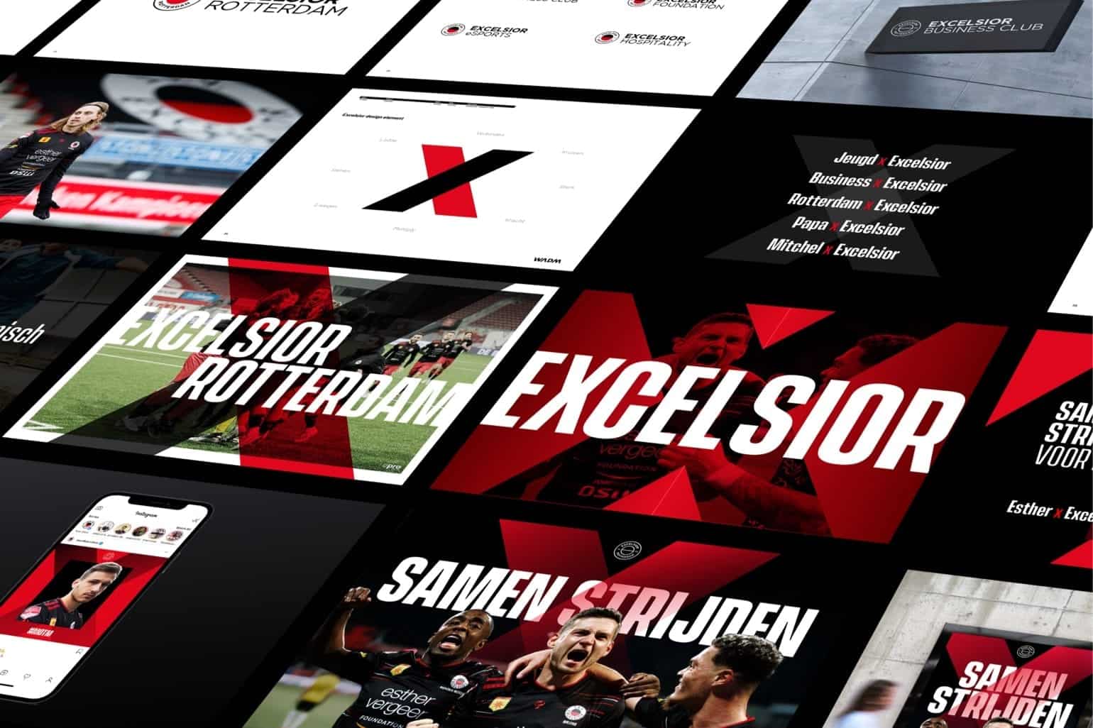
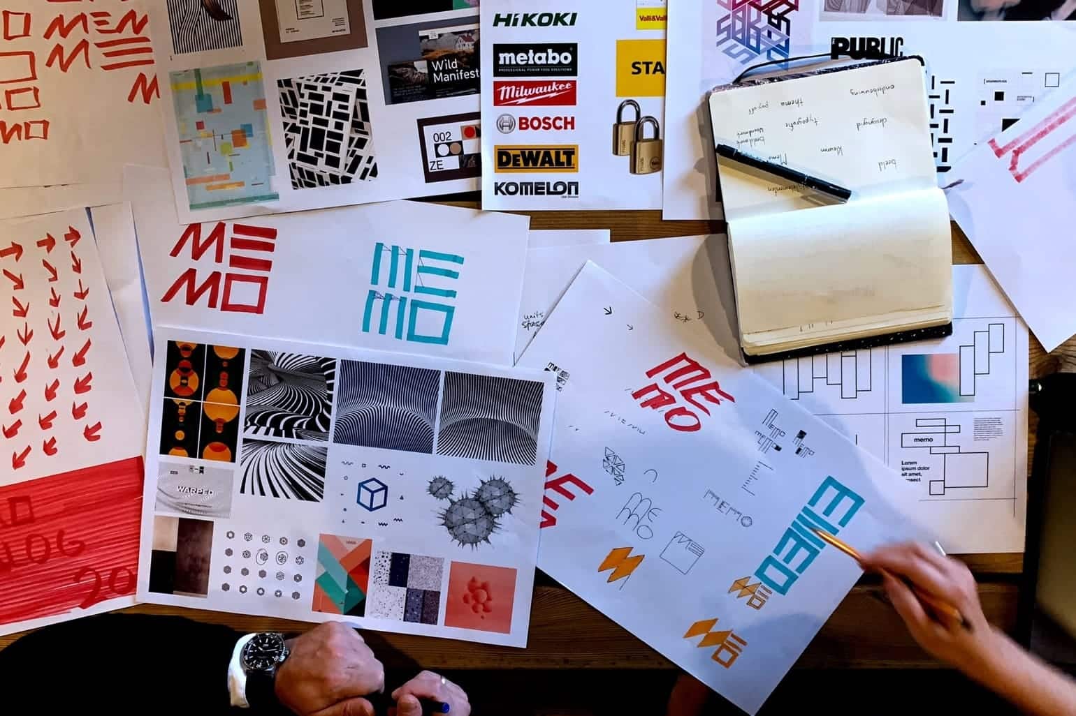
The consistent use of a limited number of colors helps to make the organization more recognizable. The emphasis should always be on differentiating yourself from the competition. And that sometimes listens very closely. That’s why at WADM we always do a complete visual analysis of the use of color. Supplemented by the choice of fonts that reinforce the organization’s identity and uniqueness. Image mark or logo variations is discussed in detail. Just like the basic style elements that form the foundation of the visual identity. All design choices are weighed with one goal: to show the ultimate underpinnings of identity.
Always guard
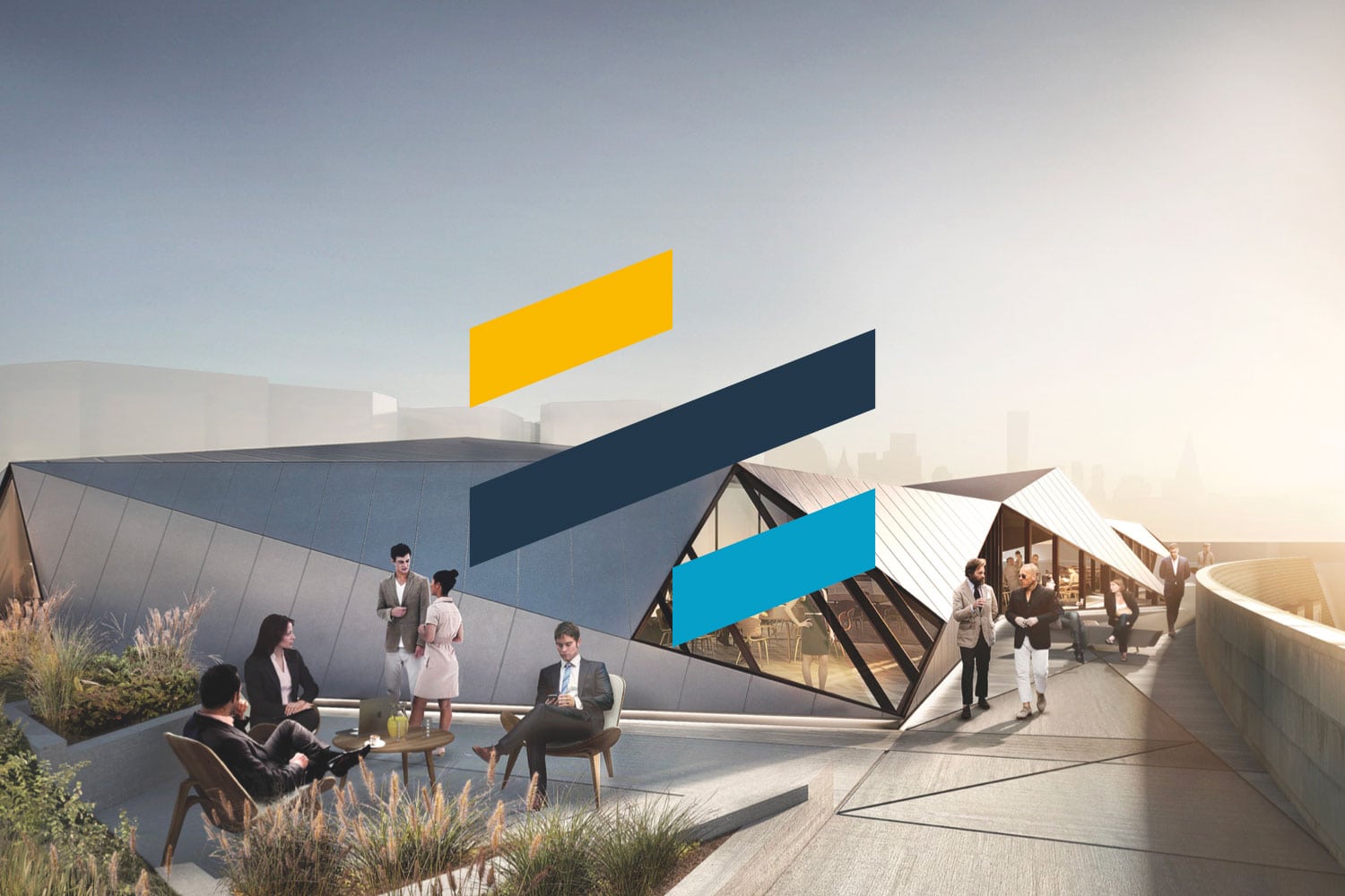
What image use will you employ? Photography? And if so, how? Always color, always black and white? Distinctive color filter? What do we do with graphs, tables? How do we fit those into the design? What is needed to make this work well for the organization? Design grids, the indispensable building block for all expressions. Pronounced choices for what you allow in social media in terms of design, for example, and what is not acceptable. What are the do’s and don’ts? Sounds childish, but doing so can save your visual identity several times over from the fate called indifference. So your visual identity should always be guarded. With your life. Or with our help.
Golden Rule
One golden rule to explain? Forward. On any manifestation of your organization, cover the logo or pictorial mark with your hand. So is what remains of that expression still recognizable your organization?
Interested?

Other Design
-
Motion design
Grab attention with movement.
-
Graphic design
Design that you will recognize.
-
UI/UX design
Pluses in conversion and engagement.
-
Brand design
Distinctive design brings a brand to life.
-
Design templates
Making it your own. With the skills of the master.
-
Service design
Designs with the right tone for every customer contact.
-
Web Design
Online designs that allow you to create new opportunities.